Introducing the New AstroStake: A Symbol of Growth and Connectivity

Change is a sign of growth — and today, we’re taking another step forward.
Since day one, AstroStake has grown from a single testnet validator into a multi-network infrastructure provider.
Our old logo no longer reflected who we’ve become — and more importantly, where we’re going.
Today, we’re excited to share our new visual identity: a symbol that captures our commitment to growth, connectivity, and the spirit of exploration that drives everything we build.
The Meaning Behind the New Logo
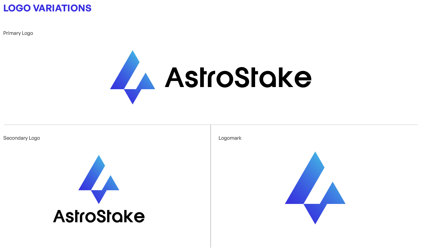
At the core of our new design lies the letter “A”, representing Astro — crafted through clean geometric shapes and upward angles that symbolize direction, progress, and ascent.
The sharp edges and diagonal cuts express momentum, while the lower vertex forms a stable foundation — echoing the idea of staking as the base of every network.
The blue-to-cyan gradient reflects technology, trust, and connectivity — mirroring our mission to build reliable validator infrastructure for the networks we believe in.

Want to use the new logo or reference our colors? Visit the AstroStake Brand Kit to download official assets and guidelines.
From Validators to Builders
AstroStake has evolved beyond validation.
We now operate across multiple networks, offering:
- Validator and staking services
- Public infrastructure (RPCs, APIs, endpoints)
- Snapshots and node resources
- Community guides and documentation
Our new logo embodies that evolution — solid, scalable, and future-ready.
It’s not just a design change; it’s a reflection of our identity as a team of builders who secure, support, and connect blockchain ecosystems.
A Symbol That Connects
The new logo’s geometry represents interconnected systems — validators, developers, and communities — orbiting around a shared mission.
Every sharp line and subtle gradient tells a story of collaboration, innovation, and belief.
“Built by node runners. For the networks we believe in.”
That’s not just our tagline — it’s the principle guiding every line of code, every block validated, and every tool we create.
Looking Ahead
This new logo marks the beginning of a new chapter.
Behind this identity, we’re preparing new tools, dashboards, and transparency reports to empower delegators and fellow builders across ecosystems.
The look has changed — but our mission remains the same:
to keep building for the networks we believe in.
Join Our Journey
Follow us on Twitter and explore our ecosystem:
- Docs — step-by-step node guides
- Stake Dashboard — delegate with confidence
- Faucet Services — claim tokens and start testing instantly
- LinkNode — infrastructure and endpoints for builders
Stay tuned — the next era of AstroStake has just begun. 🚀
More Articles
Discover more insights and guides from our team

Dec 31, 2025
2025 Recap: A Year of Building, Breaking, and Learning
A single-operator journey through multi-chain infrastructure, automation, and zero slashing.

Nov 14, 2025
Paxi Network: Roadmap, Security Audit, and Why Today’s Listing Matters
With PAXI officially listed today, AstroStake provides a clear and accessible overview of the network's roadmap, audit results, and what this means for early delegators.

Nov 7, 2025
Aztec Network and the Balance Between Privacy and Transparency
Zero-knowledge cryptography is reshaping how we build on Ethereum. As privacy becomes programmable, transparency evolves into verifiability.